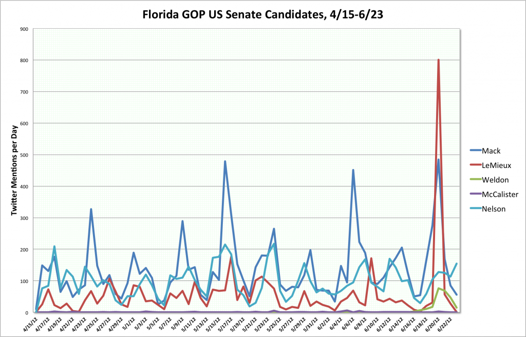
It’s been raining all Sunday, which killed my plans for the day. So I grabbed something off the back burner: what the heck are the senate candidates doing for their web sites?
The amazing thing is that almost all candidate web sites look alike these days. Splash screen asking for money. Then into the main site: Big photo on the top, sometimes with several pictures rotating through, showing the candidate. often with adoring voters. Buttons for social media, making a donation, and signing up for news letter on the top or down a side. Tweets/Facebook Likes somewhere. A menu bar with 5 or so choices. Dark (usually blue) borders on the left and right framing the content. Some text about why the candidate is the very best one could have ever hoped for.


